Case Study

DesignaCars


A complete website redesign for Durban's auto detailing studio, turning an outdated WordPress site into a clear, conversion-focused experience.

Client
Designa Cars
Role
UX Designer
Project Type
Website Redesign
Industry
Automotive Services
Year
2026

The Challenge

A strong local reputation, undermined by an unclear website.

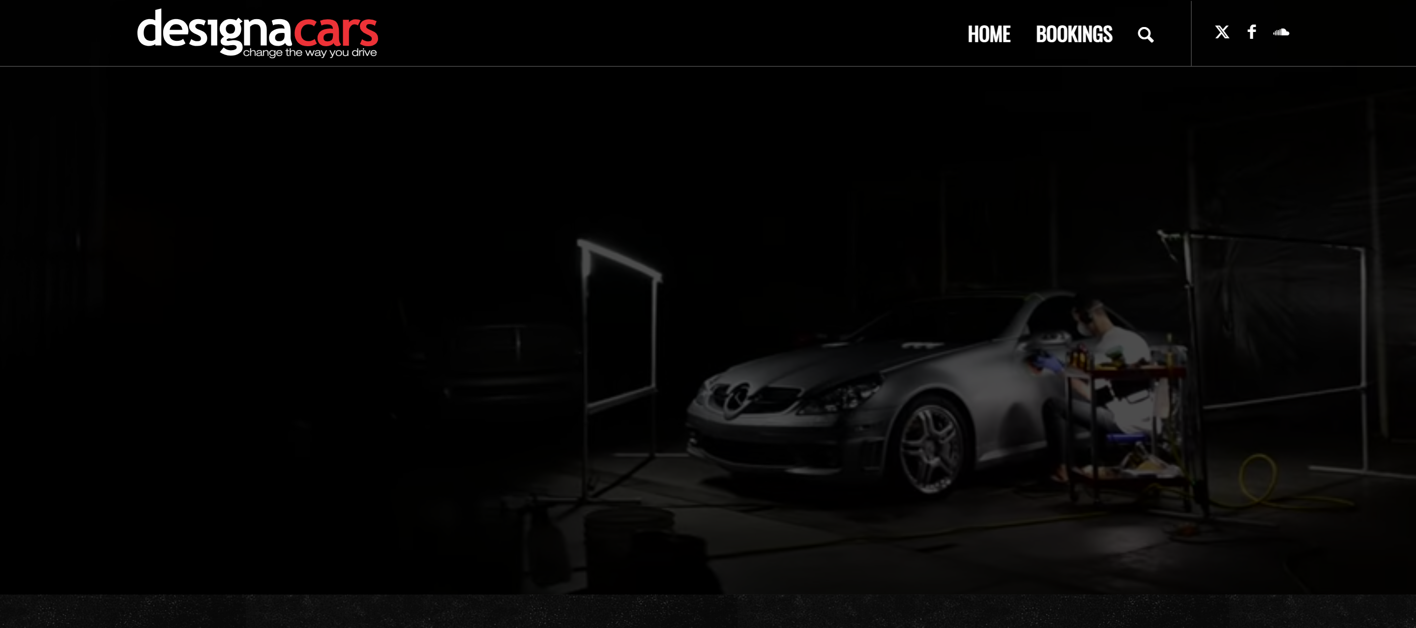
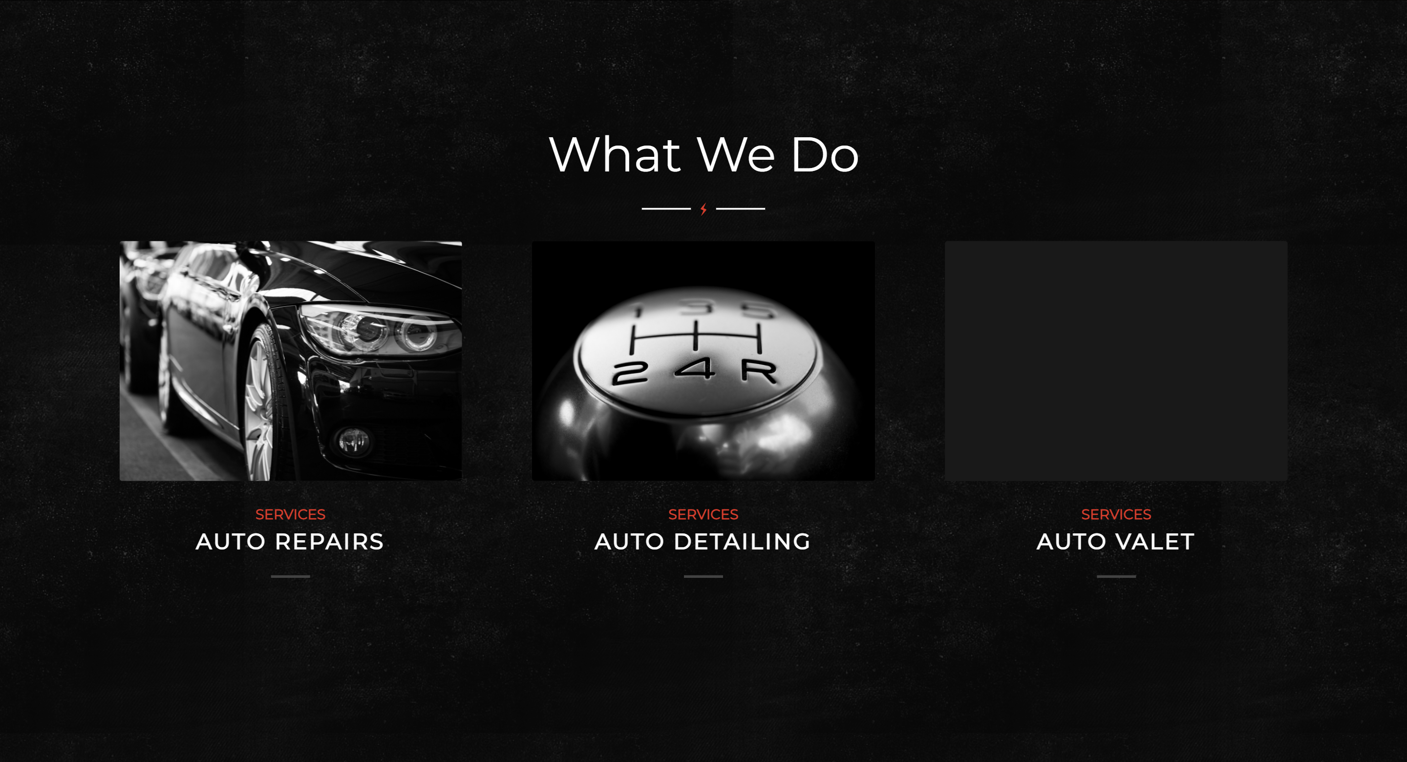
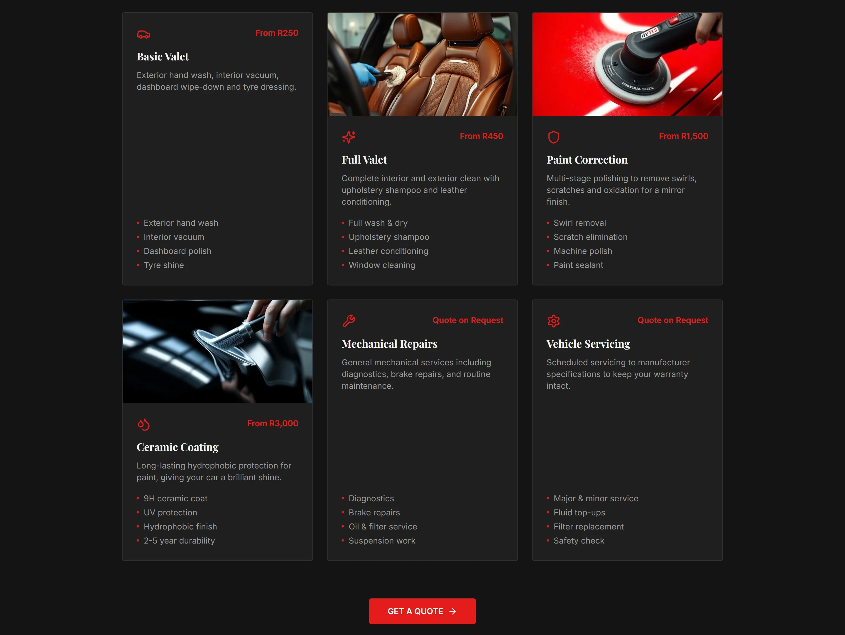
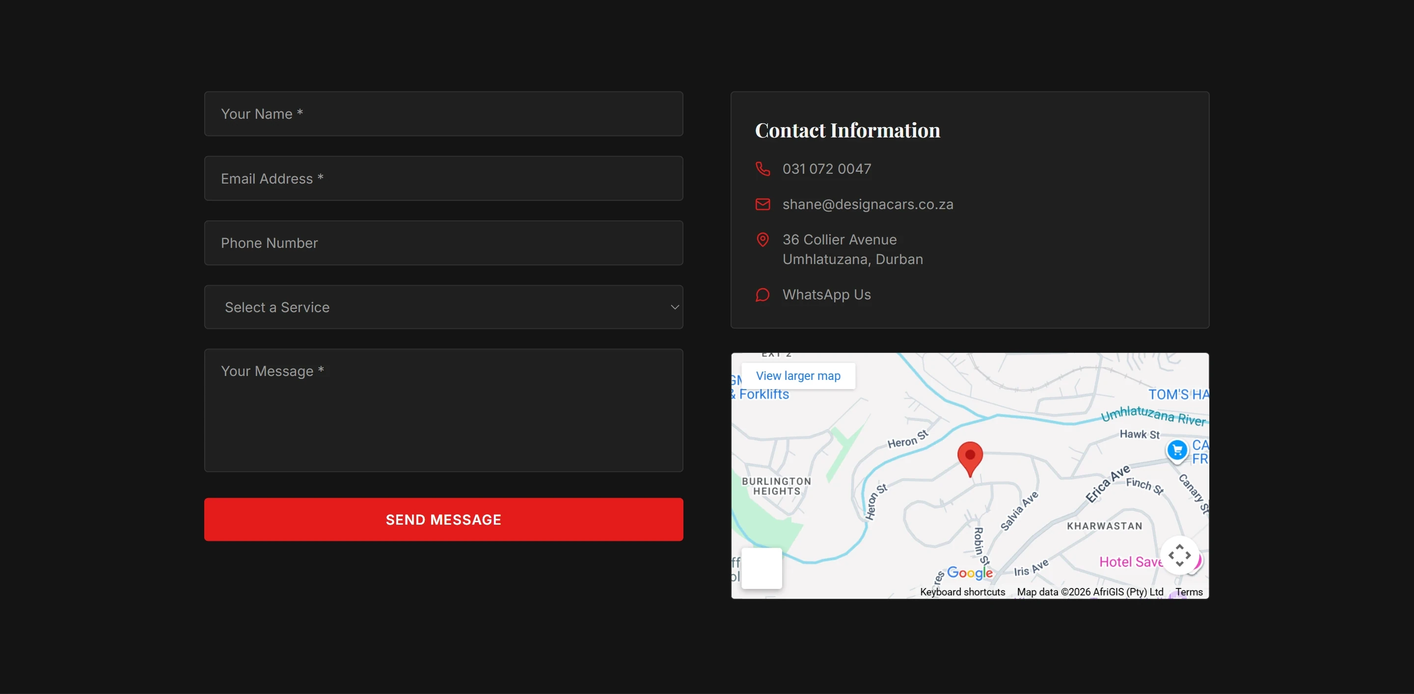
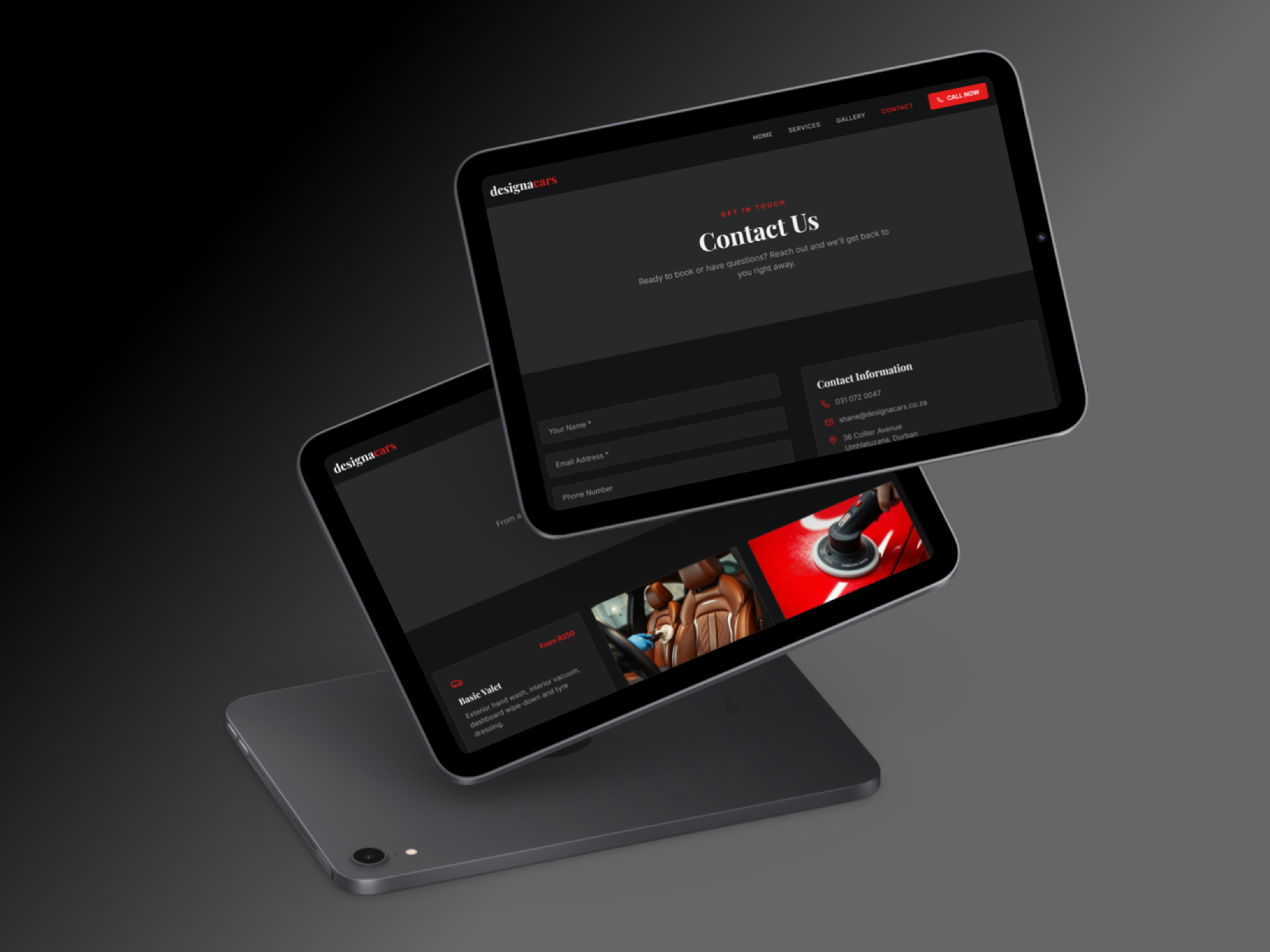
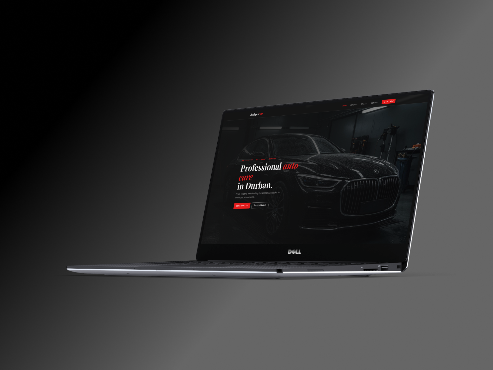
Designacars had built a solid reputation in Durban's auto care market, but their website wasn't doing them any favours. The homepage opened with a background video that failed to load on many devices, leaving visitors with nothing to look at. Services were listed as three bare categories with no descriptions and no pricing. The bookings page still had placeholder text where actual instructions should have been. Social media links in the nav went nowhere.

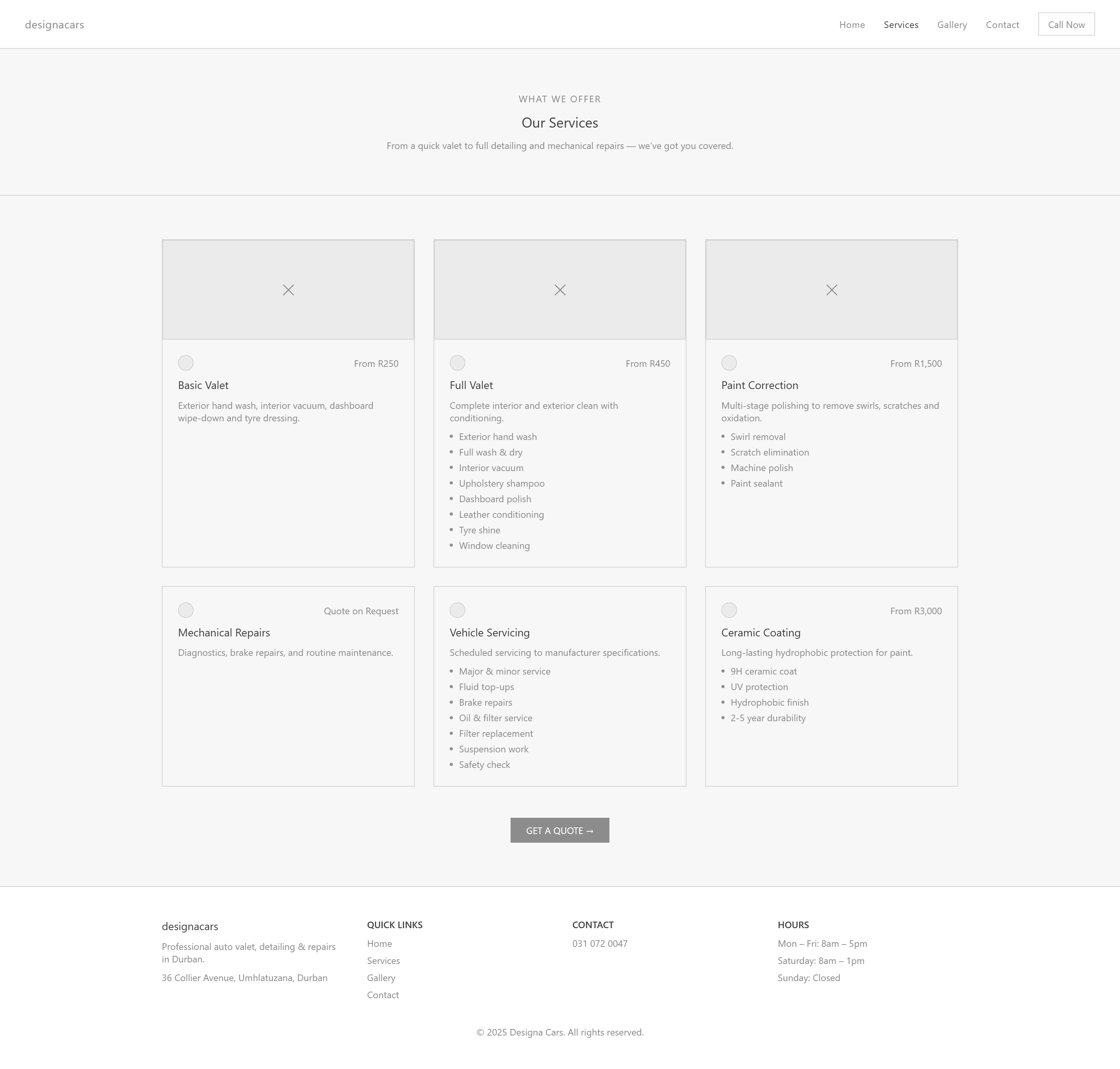
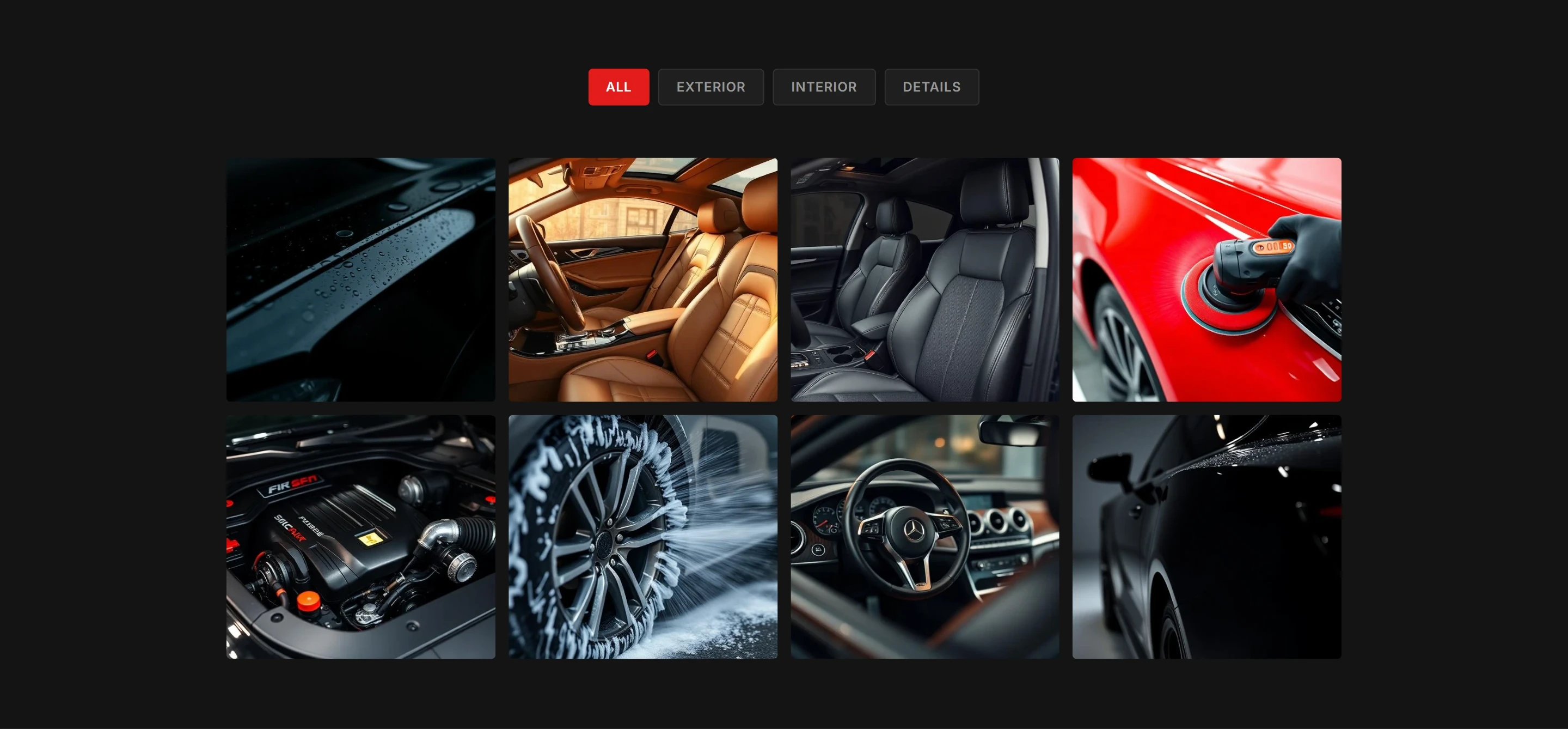
Looking at how other detailing businesses presented themselves online made the problems even clearer. Pricing, real photos of past work, and a simple way to get in touch were all standard. The original DesignaCars site had none of that. For a business with genuine quality behind it, the website was quietly losing customers.

The Approach

A clarity-first redesign focused on structure and action.

With the problems clearly mapped out, I started with content structure and information architecture rather than visual design. The core user journey was simple: arrive, understand what's on offer, feel confident enough to reach out. Every section needed to either inform the user or move them closer to that action.

I worked through the layout in wireframes first, exploring different ways to structure the hero, services, and contact sections before committing to a direction. Working at low fidelity meant layout decisions were made on logic, not aesthetics, and adjustments were quick and cheap.

Wireframes

The Screens

Homepage

A hero-driven layout designed to communicate what the business does and push users toward action. Service highlights, before-and-after previews, and client testimonials build trust as you scroll down. Every element has a reason to be there.

Services

Six service cards laid out for easy scanning and comparison. Each one shows what's included, what it costs, and what makes it different from the others. No hunting around, no guessing.

Contact

A simple two-column layout. Enquiry form on the left, contact details and operating hours on the right. Everything someone needs to get in touch without any back and forth.

Before & After

The Transformation.

Original site: Weak hierarchy and unclear messaging provide little guidance on services or next steps.

Original site: Services lacked pricing, structure, and clarity, making comparison difficult and increasing decision friction.

Original site: No visible proof of completed work, limiting trust and reducing credibility.

Original site: Placeholder content and minimal structure reduced credibility and provided little clarity around the enquiry process.

Redesigned site: Clear headline structure and prominent CTAs establish immediate clarity and a defined conversion path.

Redesigned site: Structured service cards with transparent pricing and clear breakdowns improve scannability and support confident booking decisions.

Redesigned site: Dedicated, organised gallery provides clear visual proof of service quality and strengthens user confidence.

Redesigned site: Clear form structure, complete contact details, and multiple communication options establish credibility and reduce friction in the enquiry process.

What Changed

Key Improvements.

  1. Hero Section With Purpose

    The original video hero was failing silently on many devices with no fallback, so visitors were arriving to a broken or empty experience. The redesign opens with a full-bleed photograph of a car in the studio, a clear headline establishing what the business does and where, and two immediate CTAs; Get a Quote and a direct phone number. The user knows exactly where they are and what to do within seconds.

  2. Prominent Calls To Action

    The original site had no consistent conversion path. The redesign places a Call Now button in the header on every page and repeats the Get a Quote CTA at natural decision points throughout, including a dedicated closing section at the bottom of the homepage with a WhatsApp option alongside it. There's always a next step visible.

  3. Structured Service Cards

    Three vague service categories with no detail have been replaced with six fully structured service cards, each with a clear name, description, bullet-pointed inclusions, and a starting price. Users can now scan, compare, and make an informed decision without having to contact the business just to understand what's available.

  4. Before and After Gallery

    The original site had an empty "Our Work" section with no images. The redesign introduces a dedicated gallery page that is filterable by Exterior, Interior, and Details. The homepage also previews this with a before-and-after section that immediately communicates the quality of the work. For a service business, showing real results is one of the most powerful things a site can do.

  5. Social Proof

    With no testimonials on the original site, new visitors had nothing to go on beyond the business's own claims. The redesigned homepage includes customer reviews with star ratings and names. It's a small section but it does a lot of work in building confidence before someone picks up the phone.

  6. Contact Page That Actually Works

    The original bookings page had lorem ipsum where instructions should have been and a basic form with no supporting information. The redesigned contact page includes a structured enquiry form with a service selector, full contact details, a WhatsApp link, and an embedded Google Maps location. Everything a person needs to follow through is right there.

The Outcome

A clearer, more confident digital presence.

The redesigned site addresses every usability failure identified at the start of the process. A visitor can now land, immediately understand what the business offers, browse six clearly priced services, view a gallery of real work, read customer reviews, and make contact through multiple channels, all without friction or confusion.

The experience finally reflects the quality of the business behind it.

Reflection

What I Learned

What struck me most working on this project was how much damage an unfinished website can do to a business that's genuinely good at what it does. The original site wasn't struggling because of bad visuals. It was struggling because it had never been properly completed. Placeholder content, dead links, and missing information were quietly pushing potential customers away.

Starting with a proper evaluation of what was broken before touching any design tools made the whole process more focused. Every decision had a reason behind it. The hero exists because users needed immediate context. The service cards exist because pricing transparency removes a real barrier to booking. The gallery exists because results are the product.

That shift, leading with the problem and letting the design follow, is something I want to carry into every project going forward.