Case Study

Pawly


A pet care tracker designed to help owners manage vaccinations, feeding schedules, medication, and growth milestones - all in one calm, intuitive place.

Role
UX Designer
Project Type
Mobile App
Year
2026

The Challenge

A real problem, hiding in plain sight.

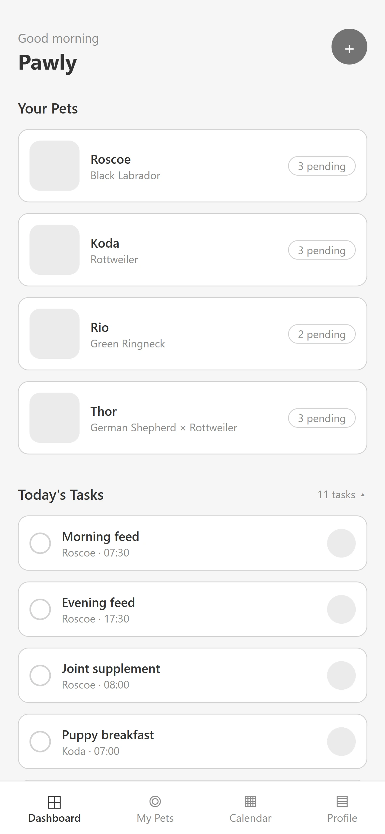
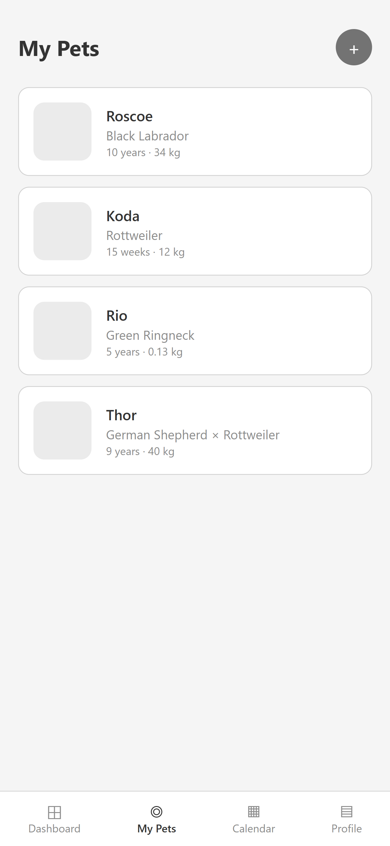
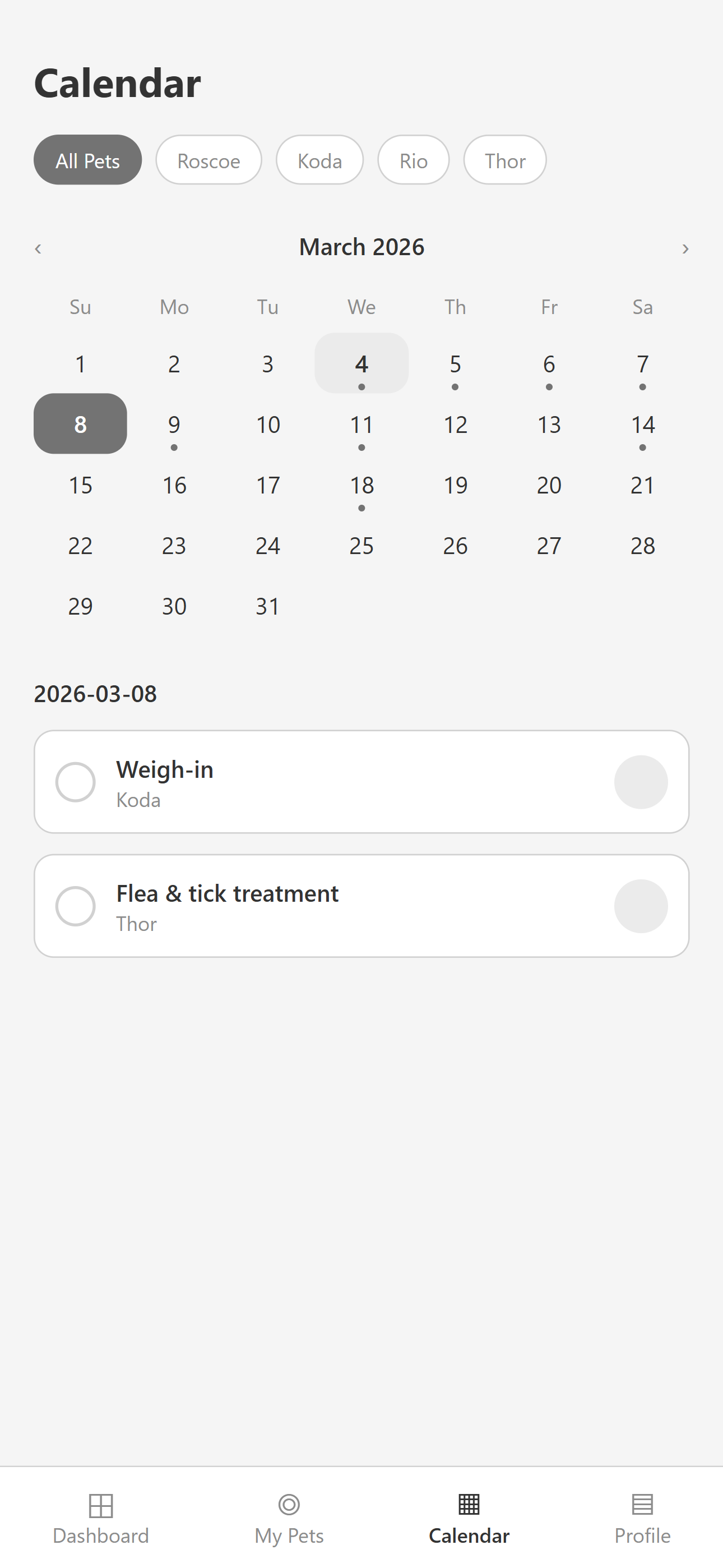
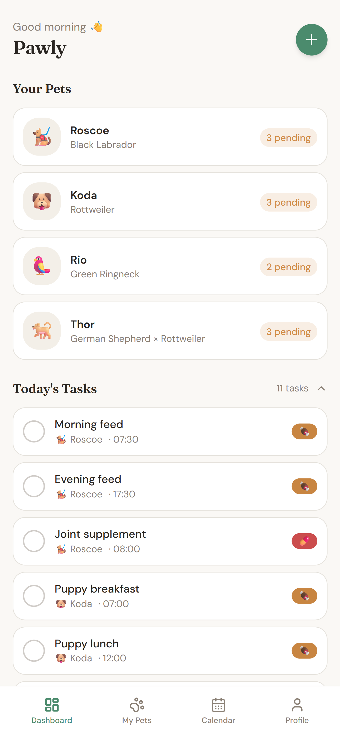
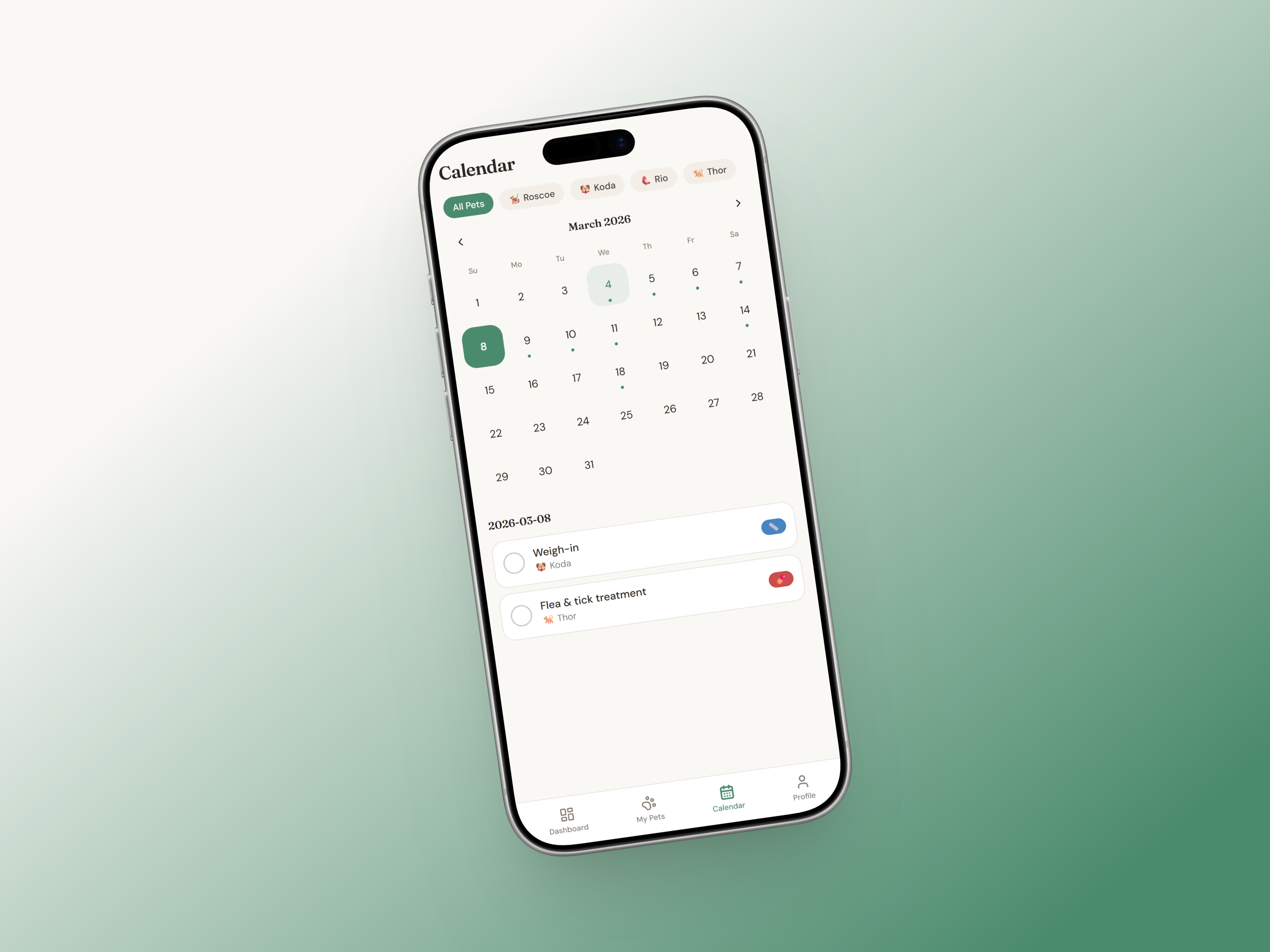
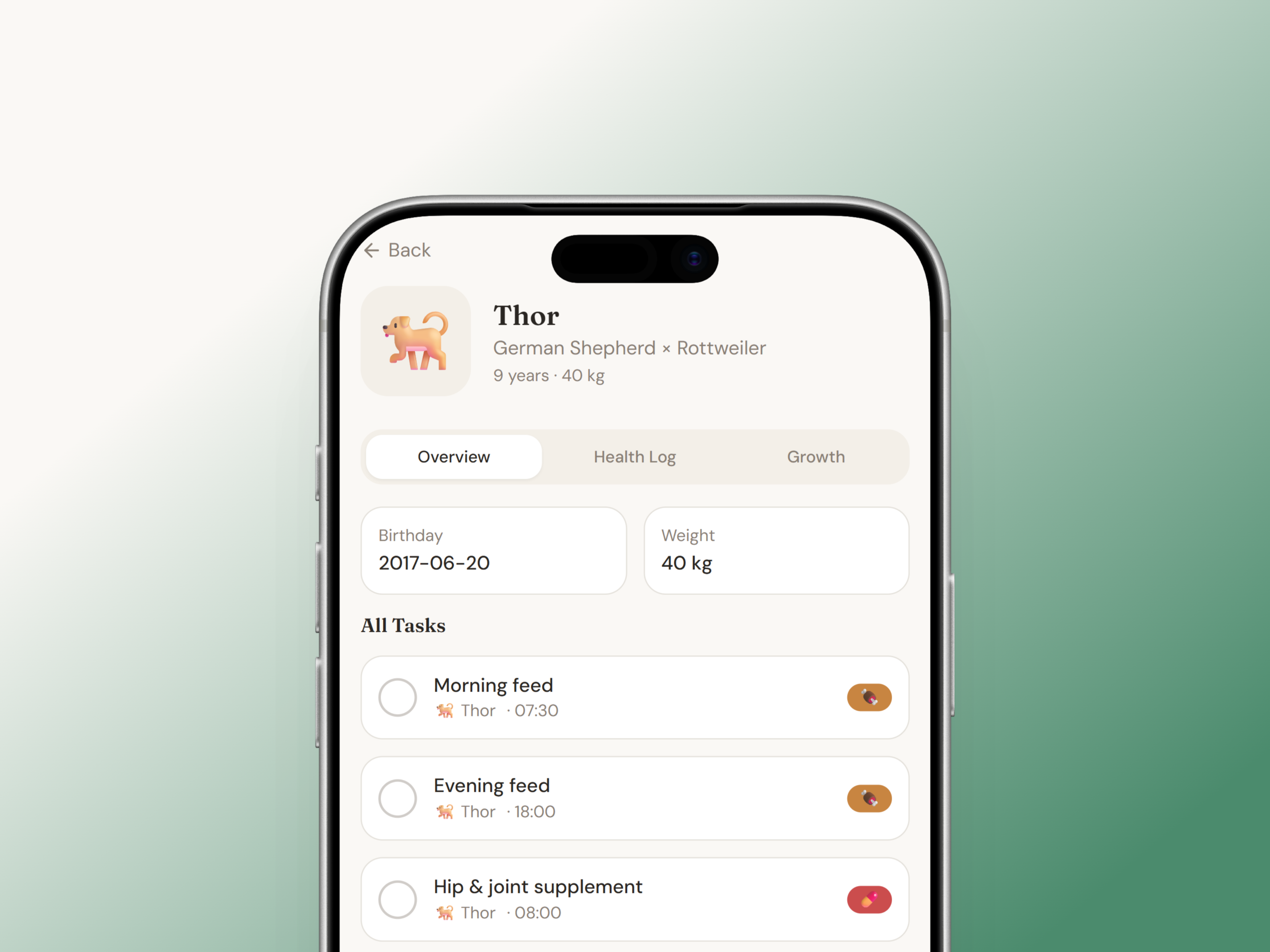
Pet owners rely on scattered reminders, memory, or manual notes to manage their pet's care. This creates real consequences for their pets' health and their own peace of mind.

Poor tracking of growth and weight

Inconsistent feeding routines

Missed vaccinations or deworming dates

Difficulty accessing medical history

The Approach

A clarity-first design focused on calm and care.

With a clearer picture of what wasn't working elsewhere, I mapped out what Pawly actually needed to be. The brief I gave myself was simple: a focused tool for daily and medical pet care, nothing else.

I listed every feature I could think of and then cut anything that didn't directly serve a pet owner's core routine. Payments, social sharing, a marketplace, a community feed, all gone. What was left was a tight set of features that covered the real daily need: tasks, reminders, health records, and a calendar.

From there I worked through the structure in wireframes before touching visual design, so the layout decisions were grounded in logic rather than how things looked.

Wireframes

The Screens

Dashboard

A hero-driven layout designed to communicate what the business does and push users toward action. Service highlights, before-and-after previews, and client testimonials build trust as you scroll down. Every element has a reason to be there.

My Pets

Six service cards laid out for easy scanning and comparison. Each one shows what's included, what it costs, and what makes it different from the others. No hunting around, no guessing.

Calendar

A simple two-column layout. Enquiry form on the left, contact details and operating hours on the right. Everything someone needs to get in touch without any back and forth.

Key Features

What the app includes.

An app focused on task visibility and reminders - no payments, integrations, or social features.

Vaccination & Vet Reminders

Never miss an appointment again

Feeding Schedule

Track meals across all your pets

Medication Logging

Track doses for all pets

Growth & Weight

Monitor development over time

Health Records

Digital storage for vet documents

Push Notifications

Timely alerts for upcoming tasks

The Solution

The screens that bring it to life.

A warm, approachable mobile app with four primary screens: Dashboard, My Pets, Calendar, and Profile.

Dashboard

The home screen shows what needs attention today. With tasks grouped by pet, upcoming items for the week, and quick-add functionality.


My Pets

A clean list of all pets with photos, breed, age, and weight. Tapping a pet opens their detailed profile with health logs and growth charts.


Calendar

A monthly calendar view with highlighted task days. Filtering by pet allows focused planning. Tapping a day reveals the full task list.


Profile

A personal hub for managing notification preferences, viewing pet summary cards, and adjusting app settings, all in one place.

The Outcome

A clearer, more confident care experience.

Pawly is a concept so these are intended outcomes rather than measured ones. But every decision was made with a specific goal in mind. A pet owner using this app should find it easier to stay consistent, less likely to miss a vet visit, and more confident that everything is in one place.

For an app like this, success isn't about the feature count. It's about whether someone reaches for it every single day without thinking twice.

Reflection

What I Learned

Simplifying this pet care tool into its most essential pieces made me reflect on my own experience caring for pets. Managing feeding schedules, vet visits, and daily routines can easily become overwhelming when life gets busy. Designing Pawly pushed me to focus on what genuinely makes caring for animals easier, rather than adding features that simply sound impressive.

By cutting scope early, shaping clearer user flows, and removing unnecessary complexity, I aimed to create an experience that feels calm and dependable, the kind of tool I would actually want to use to keep track of my own pets’ care. This project reminded me that thoughtful structure and restraint often say more about the quality of a product than a crowded list of features ever could.